Submit Your Event
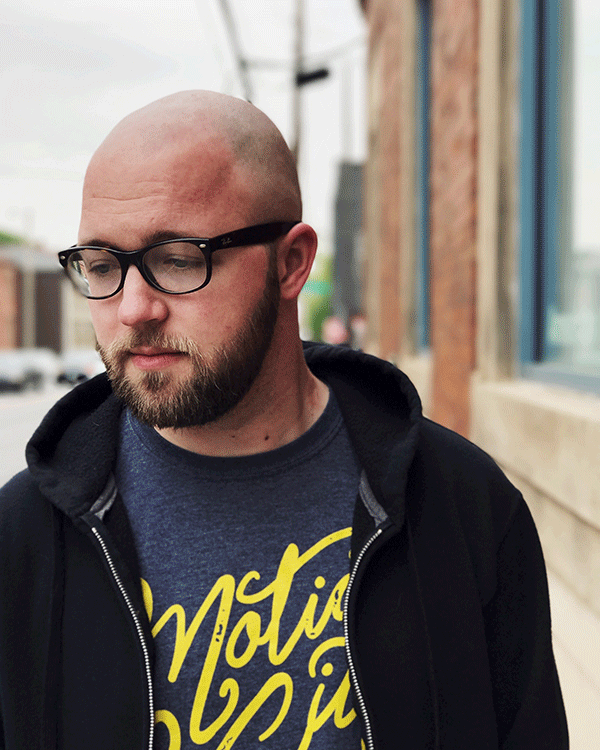

If Nick Ferran took a look in the mirror, he’d see himself: a handsome, bald-with-a-beard, 27-year-old with glasses. But what he’d also see is what a modern and relevant working artist looks like. A quick look at NickFerran.com will illuminate his talents in the worlds of graphic design, illustration, poster and printmaking as well as other just as interesting and worthwhile artistic endeavors. The detail in his art and design work shows talent in each pen mark or digital stroke. The spread of his work shows an eclectic interest in creating and disseminating art into the everyday life of the Fort Wayne region and beyond.
Ferran started his art career in the same way many do: by expanding on the typical art class basics taught in high school, elementary school and earlier.
“I’ve been practicing art in some form or another for as long as I can remember,” he said via email. “Scribbling with markers in early childhood led to drawing the logos and album art from my favorite bands in high school, which eventually led to pursuing a design and illustration degree from St. Francis.
“Now I’m a professional artist working in a design field that I wanted to be a part of before I even knew what design was. It’s been a long, strange journey to get to where I am now, but I’m just getting started. My freelance work allows me to explore pretty much any style or medium I’d like. I’m slowly learning to say ‘no’ to projects that don’t interest me or that I don’t have time for [and] that really allows me to explore and grow as a designer, illustrator and artist while still making meaningful work.”
The process of any artist is often kept behind closed doors, sometimes intentionally and sometimes just because the artists themselves don’t quite know where everything comes from or how everything grows into what it inevitably becomes. In Ferran’s case, he does a little bit of free associating, figuring out what all could go into a certain piece before journeying on to a rough sketch.
“First, I write down anything and everything I can about whatever I’m working on (words, phrases, descriptions, associated objects, places or actions, colors, etc). These then meld together and become a more solidified idea in my head, which leads me to a very, very rough sketch or series of sketches. These small, rough pencil sketches usually give me a pretty good idea of what the final illustration will look like, and I can begin the final sketch,” he said.
“The final sketch is usually full-size and thought is given to the composition. All of this happens in my sketchbook until the final illustration. I usually transfer or trace my sketch onto nice marker paper or illustration board, and then the inking begins. This is the best part of the process because I get to experiment and have fun – and I can get into ‘The Zone’ for a few hours at a time with an album, audio book or podcast,” he said.
We now know a little more about Ferran’s process, but it doesn’t give us all the information we need to understand the mind of an artist, especially a working one who relies on his or her talent day after day as part of his job, but even more importantly outside of his job where the real meat of his expression lives. We can, however, go a little further into what tools are necessary for the end result, and, in a way, this can help us understand the process of creation.
“After all the fun stuff is done, I scan the illustration and apply color in Photoshop and then do any other finishing processes to the piece, such as converting to a vector for screen-printing or applying text for a poster or album cover, for example,” he explained.
“As far as utensils go, I exclusively use Bic mechanical pencils and Tuff Stuff eraser sticks (I go through a ton of these). Micron ink pens are good, but I prefer the Staedtler brand; they do a similar job but don’t run out of ink as quickly. When I’m doing some lettering, I have a whole collection of brush pens that I like to experiment with. [My] favorite one I’ve found is from a brand called Kuretake.”
Much of Ferran’s work seems tattoo-inspired. Bold lines here, stippling there; it all lends itself to an easy crossover into the tattoo artist’s realm, though Ferran himself is not in the tattoo profession. You could say the same for someone like Justin Lim of Old 5 and Dime Sign Company, though his work is larger-than-life tattoos either as wood cutouts or painted reverse-style on glass windows.
Of course, there are more sign-based influences there, but the American traditional tattoo elements speak out more vibrantly.
Lim is a cited influence of Ferran’s, and in pieces like his “You, Me and Everyone We Knew Coffin” artwork, you can see how the bold, outer lines and thinner lines that make up the entire inner substance project and let his illustrative tendencies flourish.
Ferran’s talents really are all over the place, even in a single example. Take his “Summer in the City” piece which features more than a hundred smaller illustrations that, through being parsed out, quite literally create a feeling of summer while looking at them, both individually and as a whole. Beach scenes, ice cream, boats, hot dogs; the whole nine yards is brought into this piece to create a very detailed execution that conveys a very simple message.
It’s rarely a bad thing for working artists and designers to be all over the place, eclectic and varied. Ferran’s work is similar to that of the Indianapolis-based apparel company Yonder Clothing, Los Angeles poster artist Dave Kloc and Tragic Sunshine brainchild Kevin Wong. Google them and compare the images you find to Ferran’s work. The similarities in these images, Ferran’s included, are easily seen.
Among other influences that any artist can quote (Vincent van Gogh, Jean-Michel Basquiat, Leonardo da Vinci), local influences include (but are of course not limited to) Nate Utesch, Gregg Coffey, Bob Storey and the further talents of Julia Pott, Pat Perry and Nathan Yoder.
But perhaps the Midwest is just as big an influence as the others.
“It’s hard to imagine what about my art would be different if I didn’t live in the Midwest. Visually, the flat landscapes, tall buildings, fields of corn and old signage play into my work, but I think it goes deeper than that. The fact that there are no mountains or oceans or other large-scale natural landmarks has forced Midwesterners to create their own forms of beauty in all the details of daily life, myself included,” said Ferran.